Top Resume Mistakes and How to Avoid Them
Disclaimer
The common mistakes discussed below focus on English-speaking tech positions in Canada and the United States. Please feel free to pick and choose the tips that are apposite to your culture.
How Recruiters Scan Resumes
“A good first impression can work wonders.”
- J.K. Rowling -
The first impression is even more critical when creating a resume because recruiters only spend a few seconds deciding whether to keep reading or reject the resume right away. Before diving into the mistakes, it's crucial to understand how recruiters spend the first few seconds on a resume.
Here is a list of things most recruiters seek in their first scan:
- Number of years working in the field
- Impact at previous workplaces
- Relevant skills & technologies
- Certificates & degrees (if they're required)
- Location (local or needs visa)
After understanding the five items above of a candidate, recruiters either spend more time reading the resume or move on to the next one. Thus, avoiding the following common mistakes significantly increases the chance of success.
The Common Mistakes
Choose the Wrong Template
So many candidates with extensive technical knowledge and pertinent experience were rejected only because of an inefficient resume template. One of the reasons this is such a prevalent mistake is that resume templates are usually designed to be sold to as many people as possible and are not intended for tech jobs.
A quick search on Google "resume templates for software developer" shows more than half of the resumes are some variants of multi-column designs. These designs look stunning, which might even make you smile every time you look at the resume. That is precisely how those resumes generate a lot of revenue despite their ineffectiveness, at least in the tech world.
With only a few seconds to scan, it's easiest to go from top to bottom, similar to how you're reading this post. A two-column resume makes it harder for recruiters to navigate and find the 5 items described in the first section; consequently, they may not be very pleased having to spend more time, or they can move on. On top of readability, Johanna Rothman shared in the book Hiring Geeks That Fit the importance of knowing which resume sections a candidate values.
“ I read résumés by starting at the top, and work my way down to the final line. [...] Seeing what a candidate thinks are his or her strong points can tell you a lot about the candidate.”
- Johanna Rothman -
Let's look at the first two-column layout from my Google search as an example. Jim, please don't be offended if you're a real person.
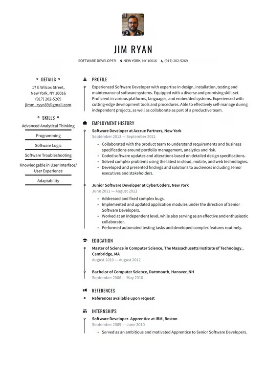
The tremendous white space on the left column right below the Skills section catches the eye immediately. The waste of space means Jim has less space to demonstrate his impact and experience. One solution is to reduce the font size and the paddings, which, in turn, would negatively affect the readability.
Lastly, multi-column designs scale poorly with resumes that need to be longer than 1 page.
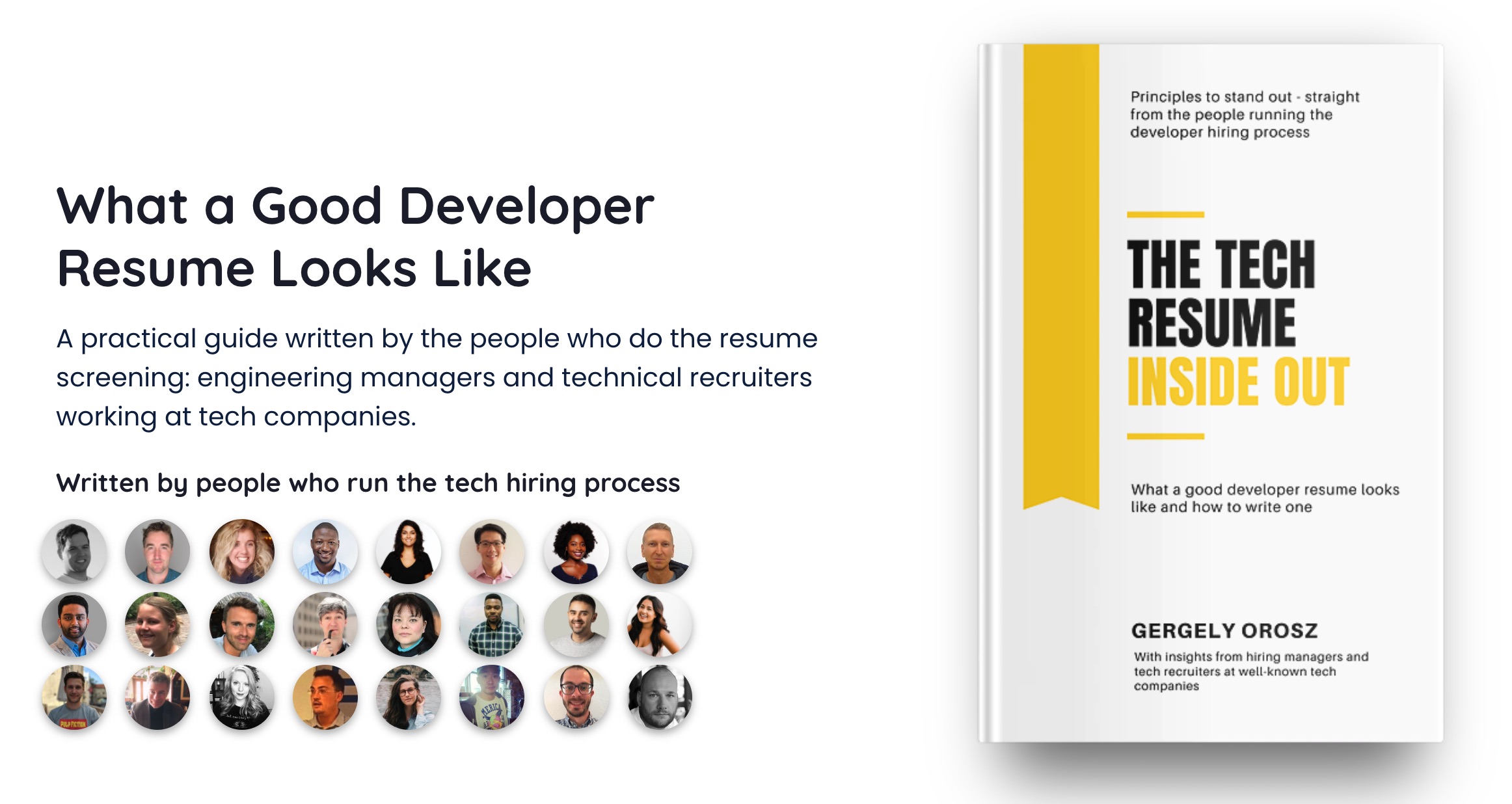
To read more about resume templates, The Tech Resume Inside Out by Gergely Orosz reserves two chapters just for this topic.
Overlook the Details
Attention to detail is considered a valuable skill of a software developer. When reviewing resumes, here are some minor things that I encounter frequently:
- Grammatical and spelling errors
It goes without saying that a resume should have zero typos and use professional language. - Misaligned positions
Similarly, all the section titles and dates should be aligned correctly and displayed in the same relative positions. - Too much or inconsistent styling
Bold, italic, underlined, and coloured are effective ways to strategically attract readers' attention to the desired content. However, too much or unpredictable usage can backfire. - Mismatched fonts and sizes
Texts that serve the same purpose (e.g., section titles and company names) should have the same fonts and sizes. - Variable date formats
Pick only one date format. If you useDec 2023, useMar 2023, notMarch 2023. Avoid number-only formats such asdd/mm/yybecause it can be easily confused withmm/dd/yy.
As trivial as these errors may be, they convey a lack of thoroughness and often make the recruiters' jobs harder to scan the resume. It also shows that the candidate doesn't know how to represent themselves properly.
Forget the Purpose
The purpose of a resume is to help you get an interview. Therefore, the resume should attract the recruiters' attention to what they seek. In other words, ideally, the resume is tailored to highlight the experience and knowledge mentioned in the job description. Although people with strong backgrounds can get multiple offers without tailoring their resumes, they limit themselves to jobs that either don't require specific skills or are similar to the ones they've held previously. How can a startup spend its money to hire someone with only web experience on their resume to develop an Android application?
However, tailoring doesn't mean copying words from the position description. I have seen too many resumes adding buzz phrases such as "fast learner" and "team player" without any evidence in the Work Experience or Projects sections. From the recruiter's perspective, those phrases don't add any value. The best way to show those attributes is through your contribution and impact.
Include the Unnecessary
With the recruiter's limited attention, it's critical to be concise and leave out anything that doesn't add value, or even harmful, to the resume.
- Languages
Don't include English and Vietnamese. Even if a language is required for the position, mentioning the relevant certifications is better. Do include coding languages, though. - Skills level
Refrain from rating yourself. Rate yourself too low, and you risk getting rejected. Rate yourself too high, and you risk getting drilled during the interview. It's a lose-lose situation. - References
References are only necessary after you have passed all the interviews. The company will contact you to ask for references at that point. - Referrals
Referrals are usually done through a system. So, you can leave that out of the resume. - Profile Image
Backgrounds, outfits, lighting, poses, and facial expressions are important considerations when taking a professional photo. Moreover, photos can create biases even when the recruiters are well-trained. For that reason, the simplest way is to omit the photo.
Final Thoughts
In a competitive job market, getting these minor things right can be the difference between landing an interview and being overlooked. I hope you enjoy the read and improve your resume in some way. Please consider subscribing for more content!
Reference






Comments ()